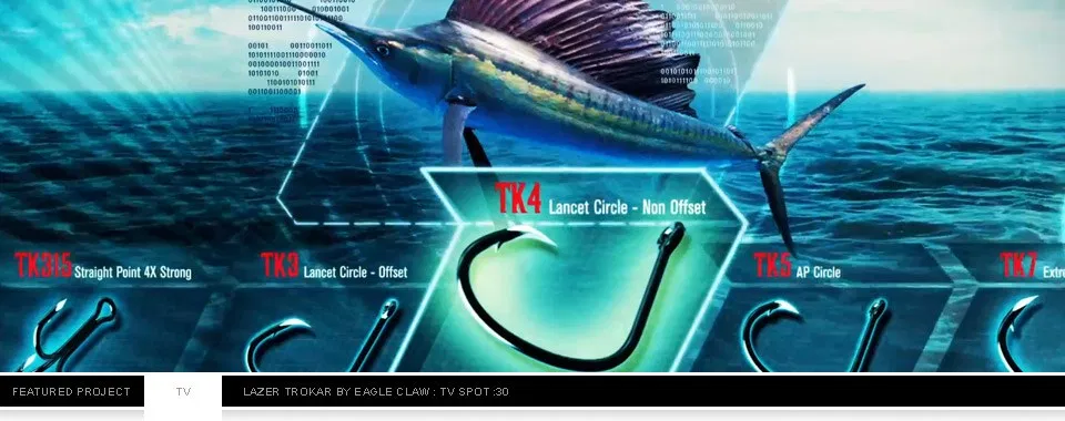
Trokar :30 TV Spot Gallery Trokar :30 TV Spot Uncategorized Trokar :30 TV Spot By Bernard Sandoval|2021-04-05T18:02:27+00:00March 29, 2021|Uncategorized|0 Comments Read More
Outdoor: Colorado Springs Sports Gallery Outdoor: Colorado Springs Sports Uncategorized Outdoor: Colorado Springs Sports By Bernard Sandoval|2021-04-05T18:02:27+00:00March 29, 2021|Uncategorized|0 Comments Read More
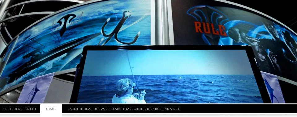
Lazer TroKar Tradeshow & Video Gallery Lazer TroKar Tradeshow & Video Uncategorized Lazer TroKar Tradeshow & Video By Bernard Sandoval|2021-04-05T18:02:27+00:00March 29, 2021|Uncategorized|0 Comments Read More
LogoLounge 7 – Published! By Bernard Sandoval|2021-04-05T18:02:27+00:00March 29, 2021|Uncategorized|0 Comments Read More
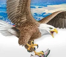
Eagle Claw Brands Gallery Eagle Claw Brands Uncategorized Eagle Claw Brands By Bernard Sandoval|2021-04-05T18:02:27+00:00March 29, 2021|Uncategorized|0 Comments Read More
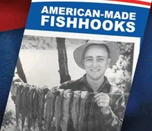
Eagle Claw American-Made Gallery Eagle Claw American-Made Uncategorized Eagle Claw American-Made By Bernard Sandoval|2021-04-05T18:02:27+00:00March 29, 2021|Uncategorized|0 Comments Read More
Eagle Claw Fishhooks Gallery Eagle Claw Fishhooks Uncategorized Eagle Claw Fishhooks By Bernard Sandoval|2021-04-05T18:02:27+00:00March 29, 2021|Uncategorized|0 Comments Read More
Wendy’s Wallscape By Bernard Sandoval|2021-04-05T18:02:27+00:00March 29, 2021|Uncategorized|0 Comments Read More
Wright – McGill Pro Ads Gallery Wright – McGill Pro Ads Uncategorized Wright – McGill Pro Ads By Bernard Sandoval|2021-04-05T18:02:27+00:00March 29, 2021|Uncategorized|0 Comments Read More
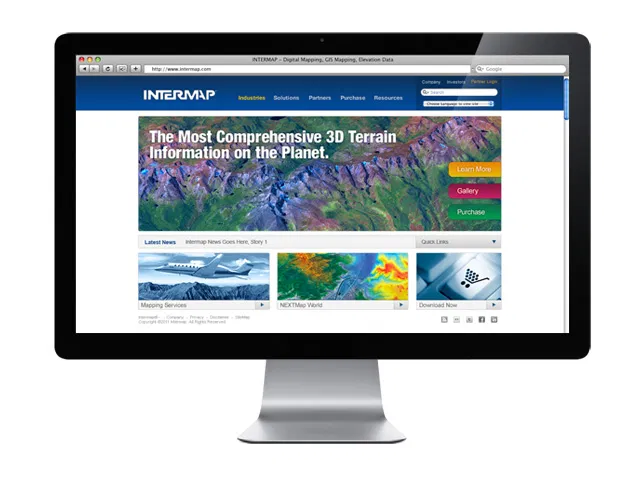
Intermap.com + Webstore UI Gallery Intermap.com + Webstore UI Uncategorized Intermap.com + Webstore UI By Bernard Sandoval|2021-04-05T18:02:27+00:00March 29, 2021|Uncategorized|0 Comments Read More